
I recently became a mother for the first time, and during the months leading up to the birth of my baby, I mentally prepared myself for the countless new things I would need to learn on the go: the correct temperature for bathwater, the art of burping a baby, what a normal amount of sleep was for a newborn, and so on. Amidst the bounty of new information, what I didn't expect to gain was a renewed outlook on User Experience. Somewhere in the trenches of late-night diaper changes and never-ending feeds, I found myself pondering design and its place in everyday life, and one lesson kept resurfacing: good UX isn't designed for perfect conditions. It's designed for real life, with all its exhaustion, distraction, and mess.
Every baby is unique, and so is every user
As with any modern parent, I found myself frantically googling things on a regular basis: "Is it normal for a baby to do this?" Sometimes the answers online would align with my baby's behaviour. At other times, it seemed vastly different. After the initial panic, I learned that I had to stop expecting the collective wisdom of the internet to be right about everything. What was more important was for me to observe and study my own baby and learn what was unique about him. The same applies to users.
It's tempting to paint users with broad strokes, and group people in large clusters based on prior experience and common research. While general resources and research on users can be helpful of course, nothing beats careful consideration of your own user base and what sets them apart from everyone else. It's in identifying those unique attributes where you will find the ability to craft niche experiences that feel truly custom and yield the best results for specific users.
This same point is explored from a different angle in Part 2 of this blog series.
Design for 2 AM, Not for the Demo
Designing for delight is a thing. But it can't be the only thing. It must also be accompanied by design for practicality, and the real life messiness of user behaviour.
A vibrant colourful pattern indicating the front and back of a diaper might seem like a perfectly reasonable and aesthetic design choice. But when it's 2 AM and you're wrangling a newborn on a changing table with one hand, and trying to pry open a fresh diaper in the other, in near pitch darkness no less, noticing colourful designs goes out the window. Instead, the tactile texture and shape of the product become far more important indicators. Instantly touching and distinguishing the difference of the front and back of a diaper can make all the difference to an already tired and frustrated parent.
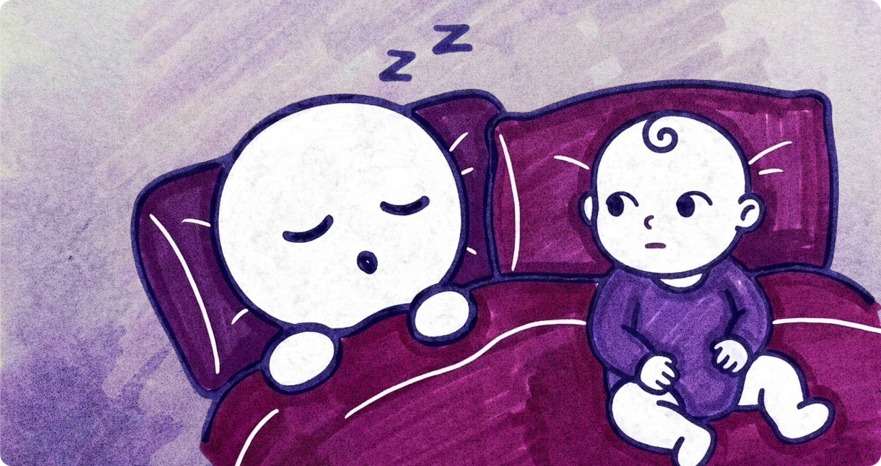
Distraction, stress, interrupted journeys and cognitive overload are all factors to be considered. Sure, we could assume that the user will sit at a desk, in a brightly lit room, carefully filling out a registration form on their laptop. And we should certainly design for that user. But we shouldn't forget the user that's standing in a moving bus, scrolling your site one-handed on their mobile phone, and attempting to type while they're being jostled around.
Dark Mode is a good example of this. I used to never get the hype around it. For certain low-light scenarios, sure, but not every app needed it. It felt more like pandering to user preference than an essential usability feature. That was until I had to be awake through the night with my newborn. Suddenly sitting in a dark room trying to do some late-night online shopping (for the baby, of course), I discovered that any app without a dark mode became genuinely painful to use. You can't design for every extraordinary circumstance a user might be in, but offering options that cover a range of them is rarely a bad thing.
Cleverness as an Afterthought
New parents are wrestling fatigue and overwhelm as they try to navigate an entirely unfamiliar chapter of their lives. In times of stress and minimal cognitive capacity, the products they appreciate the most are rarely the cleverest or most innovative or delightful. They're the ones that are predictable, intuitive and reliable.
The same is true for great UX.
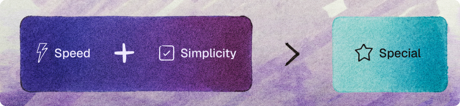
When solving design problems, it's tempting to explore different methods in an attempt to be unique and stand apart from the rest of the market. While this is certainly a worthy motive, it must be tempered with the cold hard truth that if it ain't broke, it doesn't need fixing. Some solutions have been tried and tested countless times, and have proven themselves as the de facto way to do things. In the pursuit of innovation and novelty, it's crucial not to get too hung up on making things "special." Sometimes, users aren't looking for special, they're looking for speed and simplicity. The most beautiful interface with the most whimsical interactions, will undoubtedly be useless if it can't help a user in their moment of urgency.
The Wonderful Mess
First-time parenthood certainly brings with it many new perspectives and realisations, not in the least of which, is a new-found appreciation for well-designed thoughtful products and systems. There isn't anything quite like "real-life" than learning to sustain and nurture a newborn baby, and along with it comes the fundamental reminder that design in itself is rarely for perfect conditions, and is more likely to be in service of real life, with all its wonderful messiness.